Tom Stedman, the much over-burdened Second Master, was keen to
give up the position of Printer which he had held since 1935. With this in
mind, Dearden suggested to the school Board that if he was given a permanent
job as Curator, then he would be prepared, in addition, to teach printing. His
offer was accepted and Stedman stood down as Printer (but he retained the editorship
of the school newspaper, which had
fallen to him after Whitehouse’s death).
Looking back one can see that a certain neglect in the
printing room had been evident for some time. In the decade or so after 1945
there are several signs of what is, at best, an irregularity of oversight. It’s
most likely that this was the result of the extra work Stedman had had to take
on elsewhere in the school both before and after the accident, in 1953, that
incapacitated Whitehouse, and from which he never really recovered. Stedman may
often have been relying on older boys, in his absence, who were of varying
competence. One senses, too, that the Guild hierarchy was no longer the
socially cohesive force it may once have been, and had become less effective in
developing the range of printing skills amongst all those using the printing
room. Ever erratic (except during some exceptional periods of concentrated
effort), the quality of presswork of the school newspaper once or twice plumbs
the depths during this period. For the first time there are long spells of no
news at all in the newspaper of the activities of the Guild, and although the
printers were still quite capable of rising to occasions such as the 100th
issue, or the Whitehouse memorial issue, towards the mid-1950s serious
mistakes in production start to crop up: for example, in the summer issue,
1955, there is a basic error of imposition, something previously unheard of,
and the problem recurs in the spring of 1957, resulting in deletions by hand to
the table of contents. Finally, in the summer of 1958 – and perhaps with the
new Printer now in sight – we find the printers having to resort to abject
apology: they’ve been unable to complete their make-ready. It’s odd that the
resources weren’t available to solve their problem:
We apologise for not being able to print any wood engravings.
The blocks themselves were not type high and it proved impossible to make them
up sufficiently for them to print well and also to allow the type to print.
(In mitigation, it might be added that throughout this period
the standard of correction had remained high.)
The first issue of the school newspaper under Dearden’s
direction was that of the autumn (then styled Michaelmas) term, 1958, where it
is recorded that ‘he has already begun operations in the printing room and will
soon have qualified to discard his L’. He had spent some time in the summer
term learning the craft from Stedman, while printing the pamphlet Printing at Coniston. He had already
made an impression at New House where it was noted that ‘the Ruskin Galleries
have been brought increasingly into the life of the school’. There he had
begun, the previous autumn, with an exhibition of private press books, creating
‘a great interest in book production’.
Another show from the beginning of his curatorship was an
exhibition devoted to the school’s connection with the Norwegian explorer
Fridtjof Nansen. In the autumn of 1959
the subject was the Yellowsands Press itself, its history surveyed in forty
exhibits, from Whitehouse’s Ruskin Centenary Council circular of January 1919,
printed at 13 Hammersmith Terrace, to the latest edition of the school
newspaper. Two years later there was a month-long exhibition of illuminated
manuscripts and calligraphy (including items from Dearden’s own collection).
One of the highlights was the illuminated address to Ruskin on his 80th
birthday which Whitehouse had presented personally at Brantwood in 1899.
At least one of these early shows was formally visited by
pupils, masters bringing their classes by appointment, and one is reminded in
all this of the conduct of the pre-war exhibitions, something of whose spirit
it was doubtless the intention to revive as the fortieth anniversary brought
with it a deepened sense of the school’s historical identity.
From the point of view of the printers, however, what stands
out here is Dearden’s interest in formal manuscript and its decoration. While
his first work in the printing room is (not surprisingly) largely
indistinguishable from his predecessor’s, a passion for visual enrichment soon
makes itself felt. From it, over the next few years, would emerge the
antiquarian style of decorative jobbing which was his distinctive contribution
to Bembridge printing. The long austerity into which the Yellowsands Press had
settled was at an end. Henceforth there would be a place for colour, pattern
and ornament, and a real opportunity for a revival in wood-engraving. There
would be a new sense of ambition and self-confidence in the printing room, and
a fresh enthusiasm in which many would be caught up (and a few find a
vocation). It took only a modest new investment in type and other equipment to
effect a wide-ranging impact.
The acquisition of a treadle-operated, vertical platen press
was originally the idea of the new headmaster Peter Rendall who took up his
duties at the beginning of the autumn term, 1959. The tradition of printing the
school newspaper on the Albion hand-press was unshakeable (and not questioned
by Dearden) but the new press would vastly increase the range and quantity of
smaller jobbing work which could be undertaken. It would also facilitate more
individual pupil projects and, if only implicitly, provide a new focus for care
in craftsmanship in the printing room.
But the process of renewal began before that. The startlingly
crisp and bright impression of the Spring (Lent) 1959 issue of the newspaper
shows that a great deal of worn type had been replaced (it was the first new
type for twenty years) and with it comes a marked improvement, for a time, in
presswork.
A foolscap folio treadle platen press by Jardine of
Nottingham, built c.1940, was installed in 1961, and from then on the now
regular notes on the printers’ Guild usually contain an impressive statistic of
jobs completed each term. The stiff grey wrapper (described by Dearden as
‘peacock blue’; but perhaps they were different shades), which had had to be
abandoned during the war, was restored to the newspaper (the wrapper was now
printed on the new press). After forty years of printing without any at all,
fonts of 12 and 18pt Caslon italic were obtained and the worn 18pt roman used
for headings was replaced (it was no longer available on a 16pt body). Some
36pt Caslon, roman and italic, was bought and this, the main phase of the
expansion of the typographical resources at Bembridge, was completed by the
acquisition of three sizes of Stephenson Blakes’s Old Face Open (12pt – a
mistake, surely, and rarely used - 18, and 30pt). (A little later there came a
few other typefaces, notably Perpetua Light Titling, used mainly as a drop
initial, and Poliphilus and Blado. The former was very seldom used, but the
strongly calligraphic Blado italic, stocked eventually in both text and display
sizes, became the standard face for a particularly luxe style of printed
order of service evolved later in the decade.)
The outstanding product of the new order, however, and to many
now emblematic of Bembridge School printing in its post-war reformation, is the
series of annual Nine Lessons and Carols service orders, booklets of up
to sixteen pages, which was begun in 1962. The design - typically including
wood-engravings and ornamental initials, printers’ flower arrangements and
sometimes extensive use of colour – proved long-lived, the last example being
produced in 1986. These are perhaps the most potent of all Yellowsands ephemera
in their power to evoke a particular time, place and atmosphere, and to those
who took part in printing them, they were objects of pride.


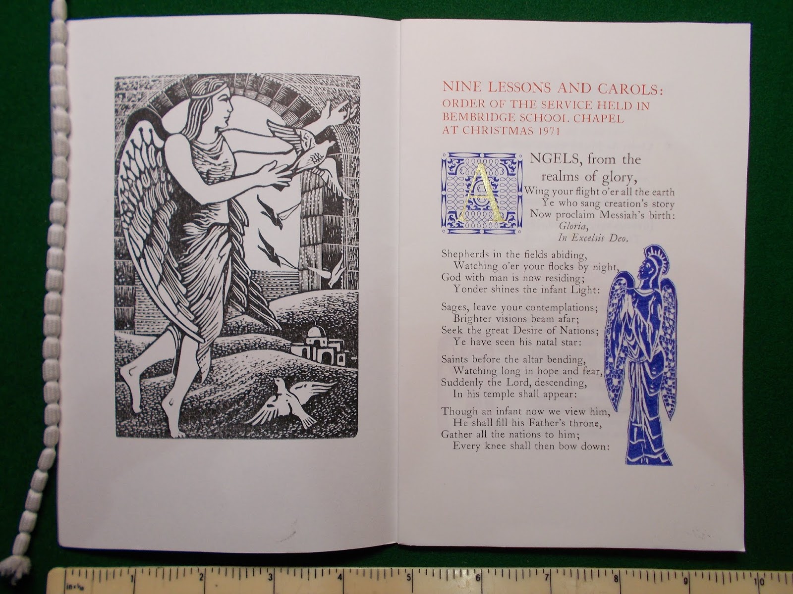
The quality of the wood-engravings available would naturally
vary but the basic typographic arrangement altered little from year to year.
The first carol service order was printed entirely in black, but thereafter the
decorative elements were elaborated, with the introduction of red and blue ink
(requiring, of course, multiple pressings), and in 1964 the addition, for the
first time, of a gold initial. This was printed cold, on a new Adana 85, from a
foil which was actually a stationer’s product intended for writing with a biro
- and while the newspaper’s claim that the process ‘not only breaks new ground
for the Press but has almost certainly never been used before in the printing
industry’ was overblown, there’s no doubt that it worked (after half a century
there’s been no loss of adhesion, and the gilding remains bright)*.
*In the 1970s and 80s the wrapper of the carol
service orders was dropped, which was a pity, but they perhaps gained from the
use of a soft white wove instead of the Yellowsands standard, Abbey Mills
Antique Laid, which was a rather brittle-surfaced esparto paper and not always
easy to print.
*
The printing requirements for the celebrations around the
school’s fiftieth anniversary in 1969 created a flurry of activity in the
printing room. They included various programmes, a richly-worked order for the
main chapel service of thanksgiving, and a traditional printers’ keepsake for
the visit of Earl Mountbatten. The occasion was marked also by the publication
of A Yellowsands bibliography 1919-1969 (two years before, Dearden had put
out a call for information from old boys about fugitive pieces). But
after forty years at the school, Tom Stedman retired (no-one had given more to
Bembridge School) and the editorship of the newspaper passed to Harold Carnell,
the first of several, relatively short-lived incumbents in a voluntary role it
would become increasingly difficult for the school to fill.
Various attempts were made over the next twenty years to
broaden the appeal of what was now perceived as a somewhat out-moded stiffness
and formality both in the look and content of the school newspaper, but few
made much impact on its essential character. Most noticeably, the notes on arts
and crafts which had been prominent from the beginning were dropped entirely by
the new editor and only restored in 1978 (as a consequence, there are no
printers’ Guild notes during this period). There were a few excellent
innovations: the interviews with older members of staff, for instance, though
they’re much too short. But some mistakes, as well: the pointed substitution,
for example, of (very coarse-screened) photographs for wood-engravings (which
might not always have been very accomplished, but were at least pupils’ own work).
There was a crossword - even, briefly (and much disapproved of by the Printer)
advertising. The old grey cover was replaced by light pastel shades intended to
reflect the seasons. From 1983, one of the Press’s miscellaneous type
collections, a very Victorian gothic was dusted off for the title on what
became a plain white cover, in a gesture that looks rather too self-consciously
‘retro’, and puts one in mind of nothing so much as how they might have printed
at St Custard’s or St Trinian’s - but as the new age of desk-top publishing
loomed there was a stubborn continuity in the typography within.
The unprecedented concentration of writing found in the
newspaper in its latter years, about the tradition of printing at Bembridge, is
partly a matter of the proximity of anniversaries and the memories these prompted,
but also suggests defensiveness in what feels like an increasingly
unsympathetic school environment. As late as 1986, however, it’s reported that
in a general review of the arts and crafts curriculum the Governors’ external
consultant had vindicated the educational practice of printing. I have been
unable to establish exactly when printing ceased to be a timetabled subject
(here Bembridge had been very unusual, if not unique, among school presses,
which were mostly run as extra-curricular societies), but the consequences of
the serious illness which temporarily removed Dearden from school in the
mid-1980s seem to have made it inevitable. (In the summer of 1984, for the
first time in its history, responsibility for the completion of the newspaper
fell entirely on the shoulders of a boy, Mason Salmon, and the colophon of the Nine
Lessons and Carols order of service that year states that it was
‘printed by M.J. Harrison’.)
Latterly, a sixth-form printing group appears to have met for
a time - and right up to the last, a small number of individual devotees were
drawn to the printing room. In 1988 it had been forced to move (to make way for
a metal-working class) from the original, purpose-built premises, to two rooms
in the old stable-block near Old House. The composing frames and treadle
platens fitted in but the ceiling there was too low to open the frisket of the
Albion.
No comments:
Post a Comment